

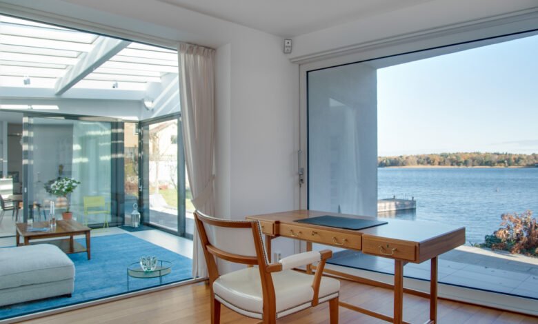
Many coastal homes continue to use the typical design elements we are all familiar with, such as white walls, navy blue accents, and some rope decorations here and there. However, contemporary coastal design has evolved a lot from that. The color scheme used nowadays is more subtle, elegant, and it is definitely not easy to just choose a shade of blue and be satisfied with the result.
The Shift From Traditional To Modern Coastal
The old-school beach house look leaned hard on obvious maritime cues – navy blue, crisp white, maybe a splash of red or coral for contrast. It’s cheerful and unmistakably nautical, but it’s also a bit predictable. You know exactly where that room is going before you walk in.
Modern coastal takes a quieter approach. Instead of shouting “beach,” it works with the soft, weathered tones you’d actually find along the coast – washed-out wood, warm off-whites, and grays with just a hint of green or blue underneath. Think sandy taupe walls, chalky white trim, and maybe a touch of sage or seafoam somewhere in the room to keep things interesting. Nothing points directly at the ocean – it’s more that the whole space feels like it grew up near one.
The tricky part is that this palette is easy to get wrong. Push it too far in the wrong direction and you end up with something bland, or worse, muddy. Done well, though, you get a house that feels quietly, unmistakably coastal – not because anything in the room is telling you so, but because the colours just feel right for where it is.
Understanding LRV And Why It Matters More In Coastal Homes
Light Reflectance Value (LRV) is a number that tells you how much light a paint color bounces back into the room. It’s on an 0 to 100 scale, with 0 being pure black and 100 being pure white. Functional interior colors (we’re not talking artist’s paints) fall somewhere in between those two extremes and the figure makes a real difference to how a room feels.
For a coastal interior, you want main living space colors with an LRV of 70 or higher. No surprise there’s an official-sounding metric for this – industry guidance published by all the major architectural paint manufacturers and cited by the likes of Pantone states 70-80% is the “optimal” range for both creating the illusion of expanded space and for “maximizing natural daylighting.” In a room with strong natural light (which most coastal homes have by virtue of their location and the large windows you expect to see) that reflectance is, well, reflective, and amplifies the brightness rather than competing with it.
Go below an LRV of 60 on main walls – creating a spacious, light-filled look pretty much requires designer attention, after all. It’s not that sub-60 shades look wrong. They just make rooms feel more contained – hardly a glowing commendation in a part of the world where spaciousness and light are the whole idea. That might be the vibe you’re going for in a home office, powder room, or bedroom, but in an open-plan living and dining room it works against the breezy quality that makes coastal homes feel, in a word, right.
Getting The Exterior Palette Right
The first thing people notice about your home is the exterior and this is where the relationship between inside and out really begins. For modern coastal, the exterior should echo the restraint of the interior rather than being a separate decision.
Weatherboard or rendered facades read correctly in sandy neutrals, warm whites, or soft stone grays. Crisp white or pale off-white on trim – fascia, window frames, and the like – define the architecture without introducing a third color. The front door is the place for a specific coastal accent, a deeper hue that ties back to something in the interior palette.
There should be a consistency of hue between inside and out which is more important in coastal homes than most. When the doors and windows are open, which they often are, the eye travels continuously between the two environments. A jarring shift in palette breaks that flow.
Finally the exterior also has to be selected with the specific coastal environment in mind. Salt air, UV intensity, humidity, and wind combine to degrade paint faster at the coast than in suburban or inland settings. The addition of a pool introduces the need to resist chlorine damage too. Achieving a flawless, weather-resistant finish on a coastal home exterior requires premium, UV-resistant formulations and proper surface preparation – the kind of work that Perth Professional Painters handle as a matter of course because they work in this climate daily and understand what the conditions actually do to paint over time.
Protecting Exterior Paint From Coastal Degradation
The paint you select for coastal locations must be designed to withstand such harsh conditions rather than simply being an aesthetic choice. Salt in the air accelerates the breakdown of common paint solutions and requires a more durable coating, and depending on your specific climate, there may be additional environmental factors that will reduce the lifetime performance of a paint job. UV exposure and high humidity are present at most coastal locations, too, which will degrade organic finishes more quickly.
Before you select a paint, consult with a professional or visit a local paint store and ask about the specific recommendations for a high-UV, high-humidity, and high-salt environment. Most locations that fit your description will share common challenges, and there are products available that exist specifically to address them. Most local suppliers can recommend a contractor who has experience with these specific paints and locations.
The Undertone Problem With White Paint
Choosing white walls is about as safe a decorating default as you can get, but it’s also one of the most challenging decisions you’ll make when painting your house. White paint comes all but pre-loaded with undertones – a whisper of warmth, coolness, or a barely there green-grey hue. Put a white paint on a large surface and those undertones will make themselves known in no time.
Toss a yellow-based neutral in a south room that lies in the path of the unforgiving afternoon sun, and that white will ping and look grimy. An icy blue-based neutral in a softened, chilled out north room and that white will read clinical and cold.
To get it right: work off how the slightest whisper of undertone reads in the light your room experiences: easterly-natural light and the duskier hours generally have a blue cast, especially in cooler months. Westerly light has a warmer, sunnier feel.
Building The Three-Part Palette
For coastal color palettes that feel balanced and calm, stick to the 60-30-10 split.
Your 60% base is your dominant wall color. The neutral that encompasses the largest continuous surface area and sets the emotional temperature for the rest of the space. For modern coastal, this is a warm white, a soft greige, a pale gray with a blue or green cast. It won’t work if it has too much overt warmth. It won’t work if it reads as cold or sterile.
Your 30% secondary is color applied to cabinetry, trim, architraves, and the large furniture pieces that occupy precious visual real estate either side of your view out to the horizon. This can be a deeper warm white, a natural linen-ish buff, a chalky off-white that deepens to shadow. It doesn’t work if it’s too bright, too dirty, too green. If it works, it’ll be a significant color without being a second dominant force.
Your 10% accent is where you get to dip your toe into the oft-cliched coastal colors – that prettiest deep seafoam, that muted navy, that most saturated warm terracotta. The pop on the front door, the feature wall in the main bedroom, the only-color-added-in soft furnishing kingdom or scattered among small decor tokens. One accent color feels intentional. Three accent colors feel tacky.
Paint Sheen Selection For Coastal Interiors
Sheen matters just as much as colour when you’re going for that relaxed coastal look – and it affects how easy the room is to live with, too.
For living room and bedroom walls, stick with eggshell or a washable matte. That’s what gives you the soft, diffused feel that coastal interiors rely on. Avoid high gloss on walls altogether – it’s a nightmare to maintain. It bounces light around the room from every angle, which means every dent, patch, or roller mark ends up on full display. It also makes a room feel harder and colder than you want, when the whole point of coastal styling is warmth and ease. Eggshell gives you a surface you can wipe down without turning your walls into a spotlight for their own flaws.
Skirting boards, architraves, and window frames are a different story – go for satin or semi-gloss there. These surfaces get handled constantly, and they need an occasional wash, so they need a bit more durability than your walls. There’s a nice side effect too: the contrast between matte walls and slightly glossier trim sharpens up the edges of the room, turning what could be a flat, shadowy line into something crisp and considered. It’s a small detail, but it’s the kind of thing that makes a coastal interior feel finished rather than just painted.
Bringing It Together
Choosing colors for a modern coastal home is a multi-dimensional process. First, you need to grasp the science behind it – LRV, undertones, the orientation of your spaces. Then, you continue to create a color palette on purpose, select the right sheen, and, finally, go for a finish that can stand the conditions it is intended for.
Yet, when all of this falls into place, you will have the feeling that your home and the coast are one thing, and you won’t even need any obvious references to emphasize that point. It is a difficult goal to reach, but that is the big difference between having a house at the coast, or a coastal home.