


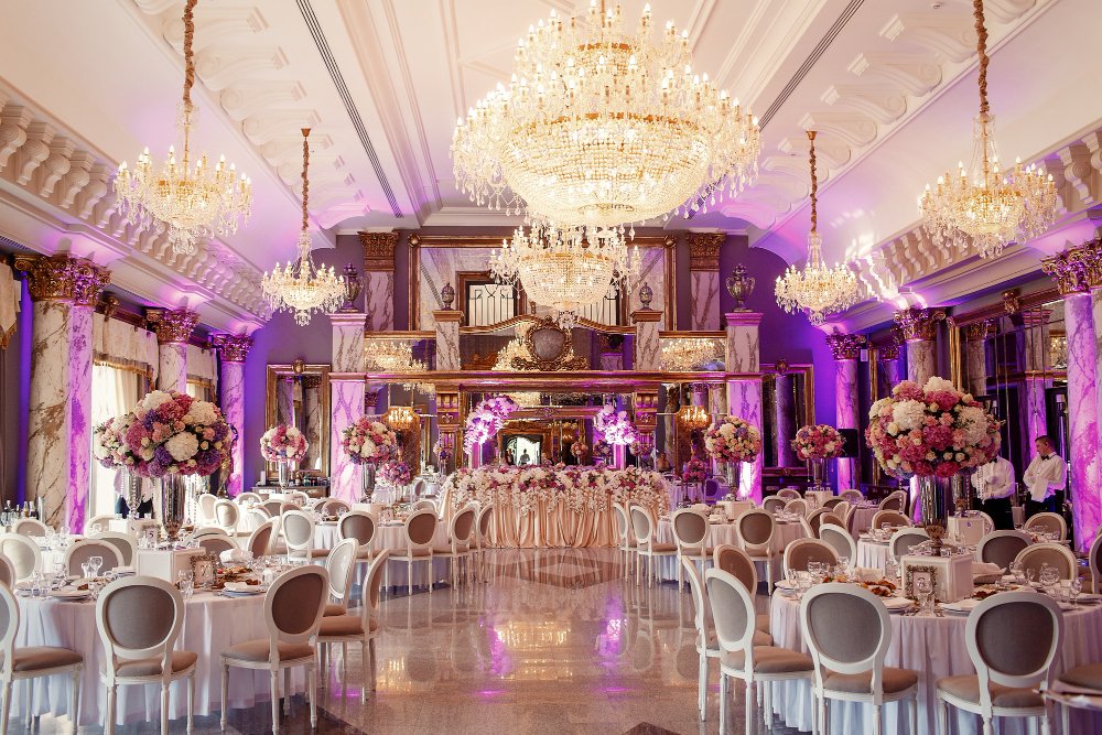
Many individuals perceive event design as decorating where you choose a color, decorate with some flowers, and coordinate the linens with the napkins. They fail to realize that texture and color are actually influencing your guests – meaning how long they stay, where they go, and how they feel when they leave.
Texture is a silent communicator
Even before a guest reads a single sign or hears a word from the host, they’ve already developed an impression by what they can see and touch. Velvet upholstery reads as intimate and expensive. Reclaimed wood says sustainable and grounded. Industrial metal combined with polished concrete signals something edgy and modern.
This isn’t aesthetic preference – it’s a psychological response to physical material. The field of tactile marketing has documented how sensory input shapes memory and perception in ways that visual-only design can’t replicate. When someone sits in a well-upholstered chair or runs their hand across a textured bar front, that physical contact encodes the experience more deeply than a printed backdrop ever could.
The formality of your upholstery fabrics sets the social contract for the evening. A linen slipcover invites casual conversation. Leather suggests a higher-stakes environment. These signals are read instantly and unconsciously, which is why furniture is a more powerful design vehicle than wall decor – guests interact with it physically, not just visually.
Color does more than set a mood
Color theory in event design is more than selecting something that looks good in photos. The right palette will help elicit the desired behavior from your attendees.
As many as 90% of instant judgments about environments can be based on color. This isn’t a minor decision to make after most of the planning is done; it’s one of the first ones you make.
High-energy colors like yellows and oranges do what you’d expect: grab attention, create a sense of urgency, and even speed up the pulse. You might not want someone feeling all that at an all-day meeting, but they’re great for a 15-minute activation, a product launch, or a breakout session at a conference.
Blues and greens are the colors most found in nature and our earliest memories; they bring the pulse down, invite reflection, and communicate trust. They’re ideal for networking receptions or client dinners where you want to build relationships with someone.
The concept that fastest isn’t always best is equally true for color selection. Pick one without considering dwell time, and you’re essentially designing a restaurant without considering table turnover.
Monochromatic schemes, which incorporate shades of a single hue, create depth without visual noise. They’re harder to execute but consistently deliver a more polished result in event photography, particularly in large-scale venues where flashing cameras tend to flatten surfaces.
Layering materials prevents a flat room
One of the most common mistakes made in the design of large venues is treating the entire space as a single visual plane. When every wall, floor, or ceiling is finished with the same veneer, the same weight of material, and the same color or pattern, photographs of that room look washed out under professional lighting. It’s an optical illusion, but one that translates to in-person experience, too.
You can’t “fix” that room in the conventional sense, but you CAN give the eye something exciting to look at. The important thing is that the contrast in question doesn’t have to be color – though in the case of matte finishes and metallic accents, or rough textures and against the plush upholstery, it can be. A commitment to biophilic design principles (incorporating natural patterns and textures such as wood grain, or stone-like finishes) produces the same kind of experiential depth while reducing attendee anxiety in large, noisy environments.
Nothing downplays the value of soft furnishings and heavy fabrics. They play a crucial role in “acoustic architecture”: a venue designed solely with reflective surfaces can feel hard on the ears, no less jarring than it looks. Making simple things like seating upholstered, adding drapery or textiles, even employing spatial separators in cloth, all work to absorb and dampen sound levels without ever flipping a switch on a soundboard.
This is where sourcing from the right partner becomes a practical issue, not just a stylistic one. Working with Epic Party Team gives planners access to diverse, color-coordinated inventory – the specific textures and finishes needed to build layered environments rather than settling for whatever happens to be available from a single generic catalogue.
Color as a navigation tool
Using strategic pops of color amidst a neutral color scheme within your event space can direct guest movement as efficiently as if you had physical wayfinding signage posted. An accent chair in a bold hue or an ottoman upholstery in a bright color that’s situated near the registration booth will simply draw people to that area. A bar front that’s a different or bolder hue acts like a magnet to draw people to the bar no matter how roomy it is.
You’re applying the concept of visual hierarchy to spatial flow in a way that just feels right. If guests feel like they’re entering, exiting, gathering, and circulating in a space without even thinking about it, the event feels successful, even if they’re not quite sure why. If spatial flow isn’t taken into consideration, you have people bottlenecked at entrances and bar areas and no one utilizing the back half of the room.
Use the Pantone Color of the Year as a reference point for this. Not because every successful event needs to be trendy, but because social color associations will change, even subtly, year over year. The color palette that effectively reads “luxury” or “trustworthy” to your clients may change from year to year, and not keeping that in mind could read as “out of touch” or “uninspired.”
What this means in practice
Furniture and design choices create the look and feel that frames an event. But, this is about more than aesthetics. Texture and color affect emotions, drive behavior, and can be used to tell a particular story. Music and lighting can be adjusted to counterbalance certain “feelings” in a room, but it’s a lot easier if the texture and color in the room are already in alignment.